17 Plotting
This chapter will cover the basics of creating plots in R. It will begin by demonstrating the plotting capabilities available in R out of the box. These capabilities are often referred to as “Base R”. In the resources section, you can also find resources to learn more about “ggplot2” which is one of the most common plotting libraries in R.
17.1 Plotting your Regression Model
Now that you’ve learned how create a linear regression model, let’s look at how you might go about representing it visually.
Here’s a preview of the dataset we’ll be using:
| y | x |
|---|---|
| -4.400327 | 1 |
| 5.428396 | 2 |
| 1.401835 | 3 |
| 8.347445 | 4 |
| 4.653595 | 5 |
| 1.768966 | 6 |
We’ll begin by just creating a scatter plot of the raw data.
plot(df$x, df$y)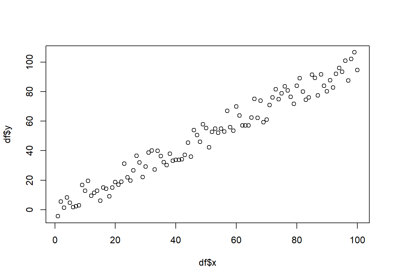
Additionally, you can alter the appearance of your points by using the “pch”, “cex”, and “col” options. PCH stands for Plot Character and will adjust the symbol used for your points. The available point shapes are listed in the image below.
ggpubr::show_point_shapes()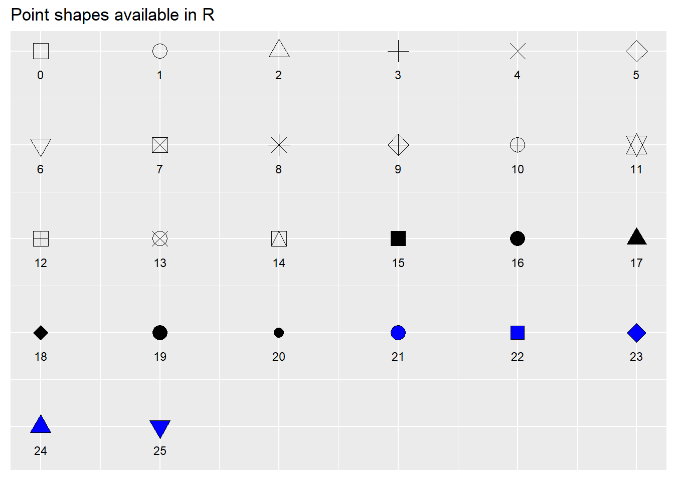
The “cex” option allows you to adjust the symbol size. The default value is 1. If you were to change the value to .75, for example, the plot symbol would be scaled down the 3/4 of the default size. The “col” option allows you to adjust the color of your plot symbols.
plot(df$x
        , df$y
        , col=rgb(0.4,0.4,0.8,0.6)
        , pch=16
        , cex=1.2)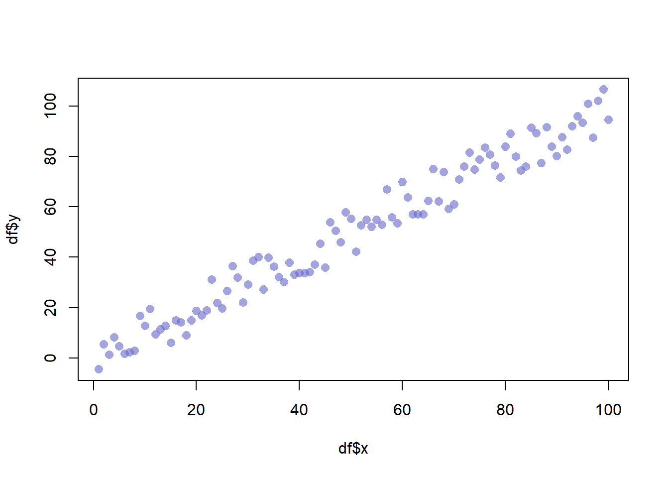
You can adjust the axes with the “xlab”, “ylab”, “xaxt”, and “yaxt” options (amongst other available options). In the following example we will remove the axes altogether.
plot(df$x
        , df$y
        , col=rgb(0.4,0.4,0.8,0.6)
        , pch=16
        , cex=1.2
        , xlab=""
        , ylab=""
        , xaxt="n"
        , yaxt="n")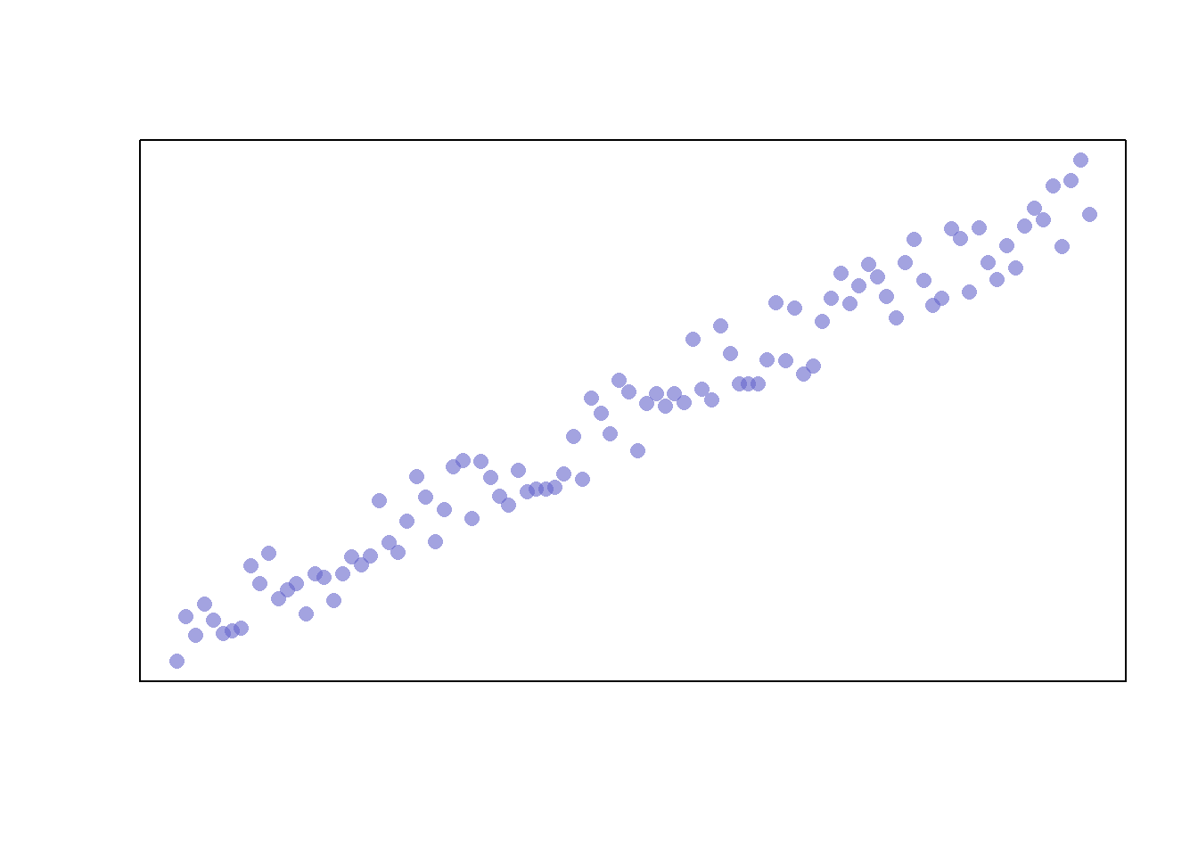
Finally, you can add a trend line by creating a model and adding the fitted values to the graph. We’ll also adjust the line width and color with the “lwd” and “col” parameters, respectively.
plot(df$x
        , df$y
        , col=rgb(0.4,0.4,0.8,0.6)
        , pch=16
        , cex=1.2
        , xlab=""
        , ylab=""
        , xaxt="n"
        , yaxt="n")

model <- lm(df$y ~ df$x)
abline(model, col=2, lwd=2)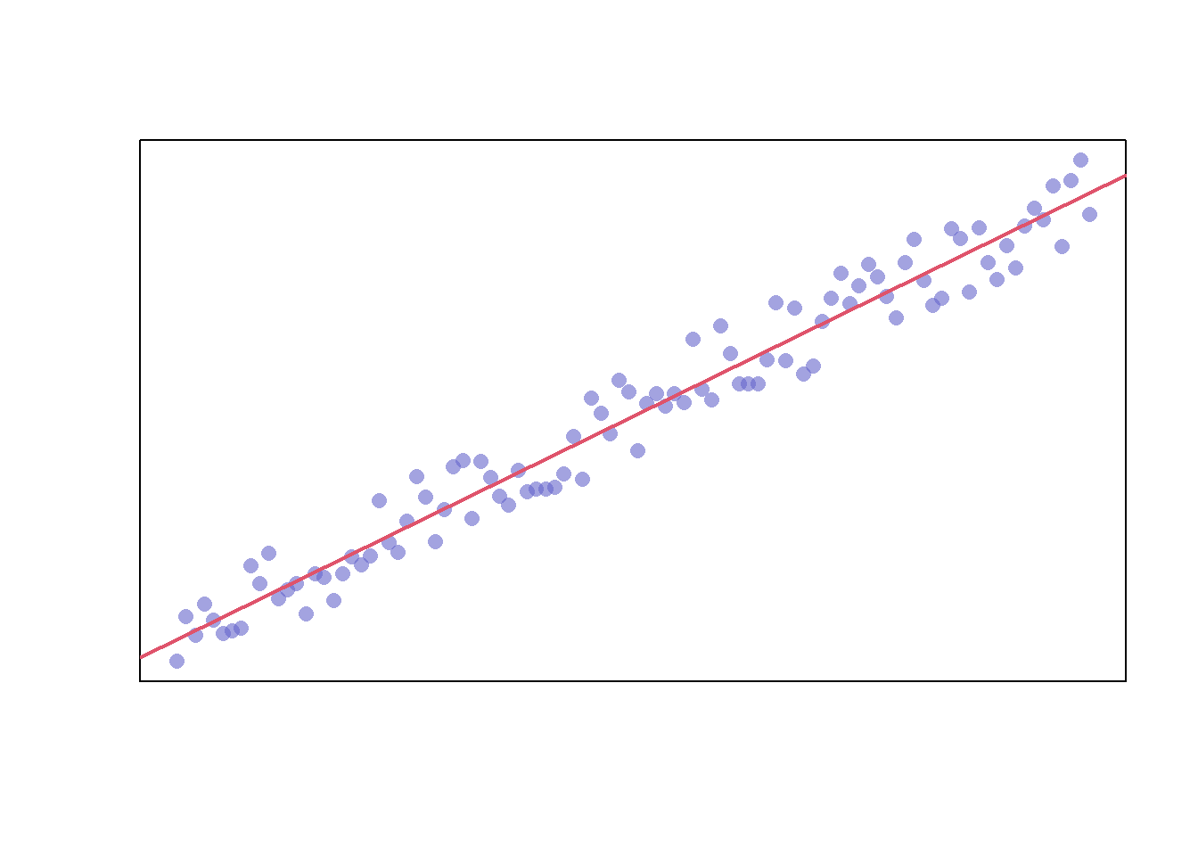
The model also returns confidence intervals for the predictions, which can be added
# Extract the upper and lower 95% confidence intervals of the predictions
conf_interval <- predict(
  model,
  newdata=data.frame(x=df$x),
  interval = "prediction",
  level = 0.95)

plot(df$x
        , df$y
        , col=rgb(0.4,0.4,0.8,0.6)
        , pch=16
        , cex=1.2
        , xlab=""
        , ylab=""
        , xaxt="n"
        , yaxt="n")
abline(model, col=2, lwd=2)
lines(df$x, conf_interval[,2], col="blue", lty=2)
lines(df$x, conf_interval[,3], col="blue", lty=2)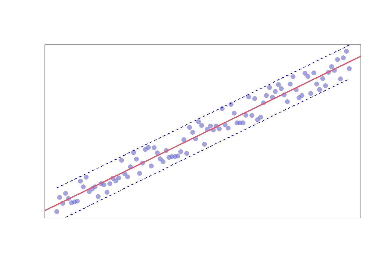
17.2 Plots Available in Base R
Now that you’ve seen how to build a scatterplot in R, let’s take a look at other plots available in Base R.
17.2.1 Box Plot
One plot you’ve already seen in the outliers chapter is the box plot. These plots can be created via the “boxplot” function.
boxplot(mtcars$mpg)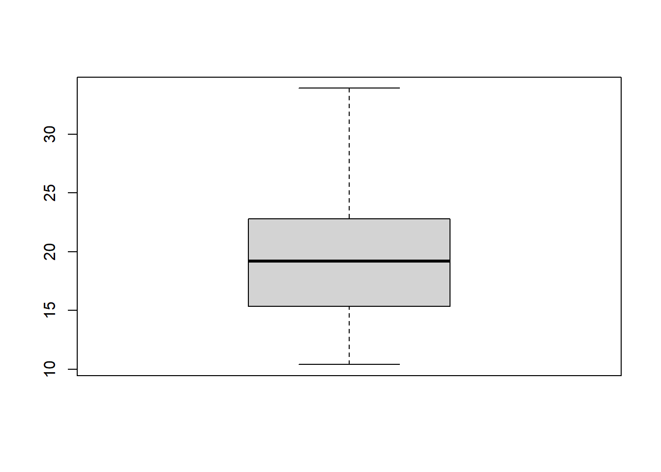
We can build on this plot by specifying the dataset with the “data” parameter, removing the “mtcars$” prefix from our variable, adding a plot title with the “main” parameter, and adding axis labels with the “xlab” and “ylab” parameters. Additionally, we are going to add an additional variable for our data to be categorized by.
boxplot(mpg ~ gear
            , data = mtcars
            , main = "Car Mileage by Gear"
            , xlab = "Number of Forward Gears"
            , ylab = "Miles Per Gallon")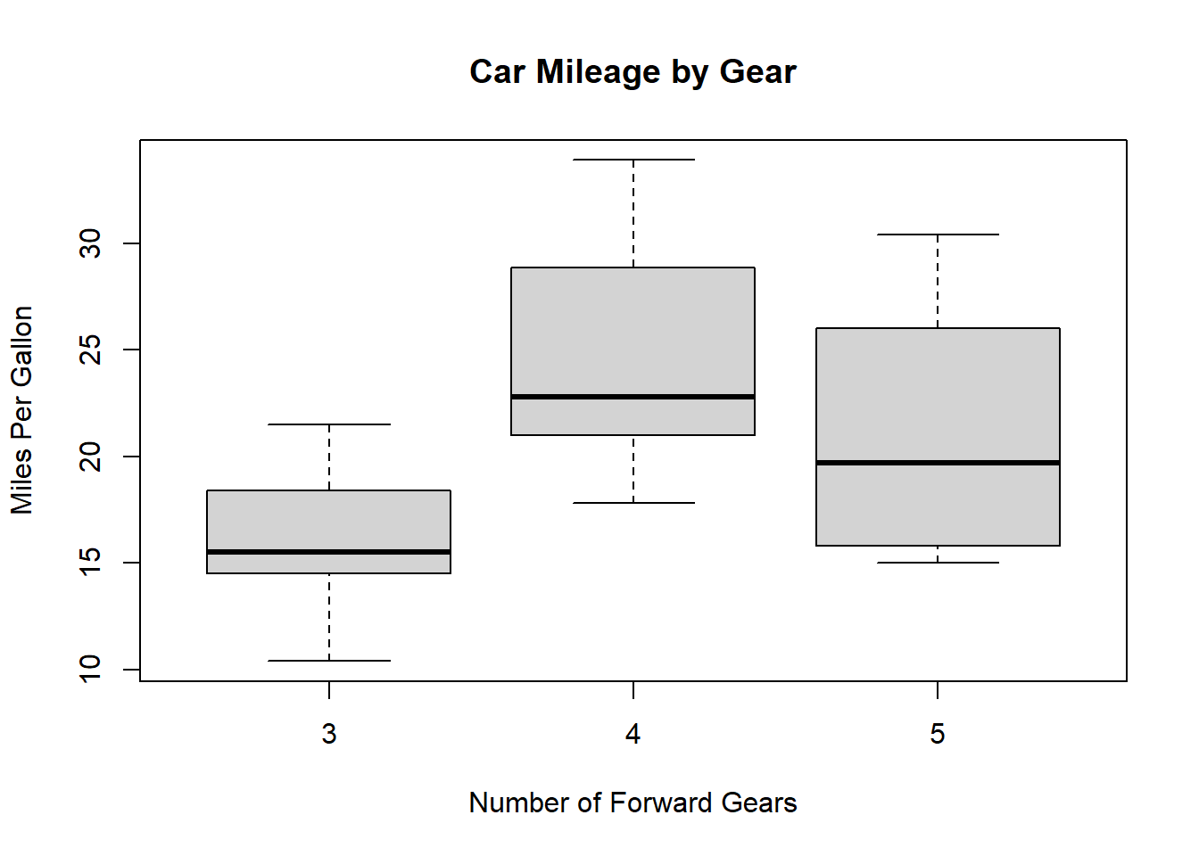
Finally, we can set the box colors with the “col” parameter and set “notch” equal to “TRUE” to give our boxes notches. If the notches of two plots do not overlap this is ‘strong evidence’ that the two medians differ Chambers and Tukey (1983).
boxplot(mpg ~ am
            , data = mtcars
            , notch = TRUE
            , col = (c("blue", "grey"))
            , main = "Car Mileage by Engine"
            , xlab = "Automatic?"
            , ylab = "Miles Per Gallon")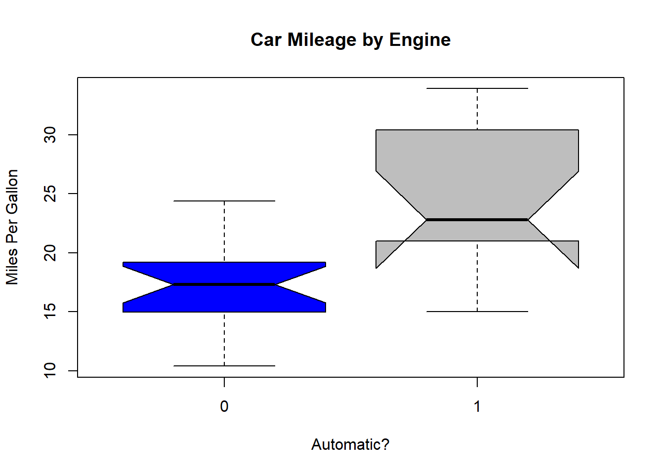
17.2.2 Plot Matrix
You can use the “pairs” function to create a plot matrix. Let’s use the iris dataset to demonstrate this.
pairs(iris)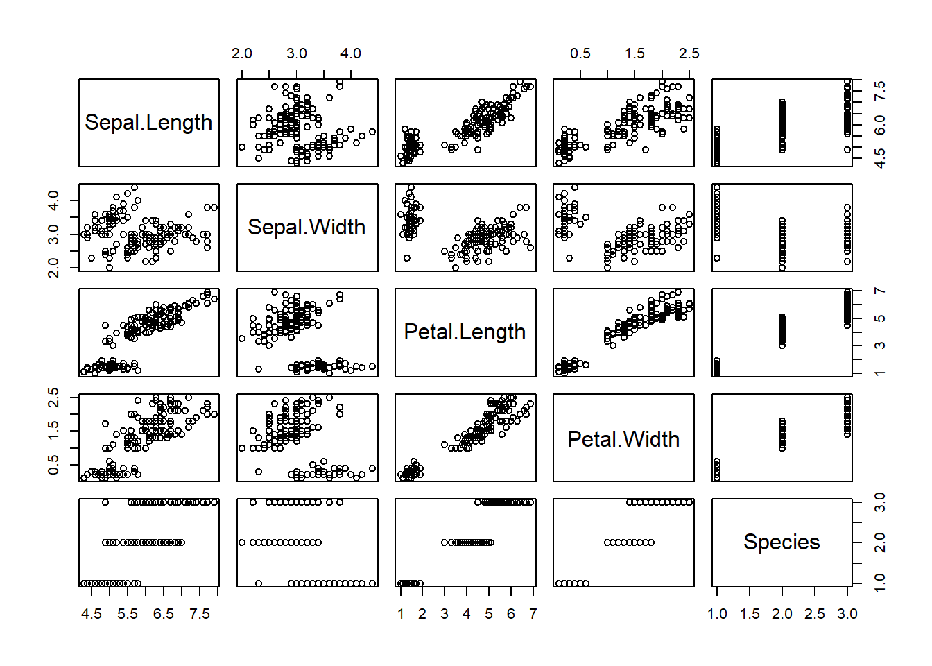
This plot gives us the ability to see how each variable interacts with one another.
17.2.3 Pie Chart
Let’s try plotting a pie chart of species in the iris dataset via the “pie” function. This function accepts numerical values so we’ll need to use the “table” function on our column as well.
pie(table(iris$Species))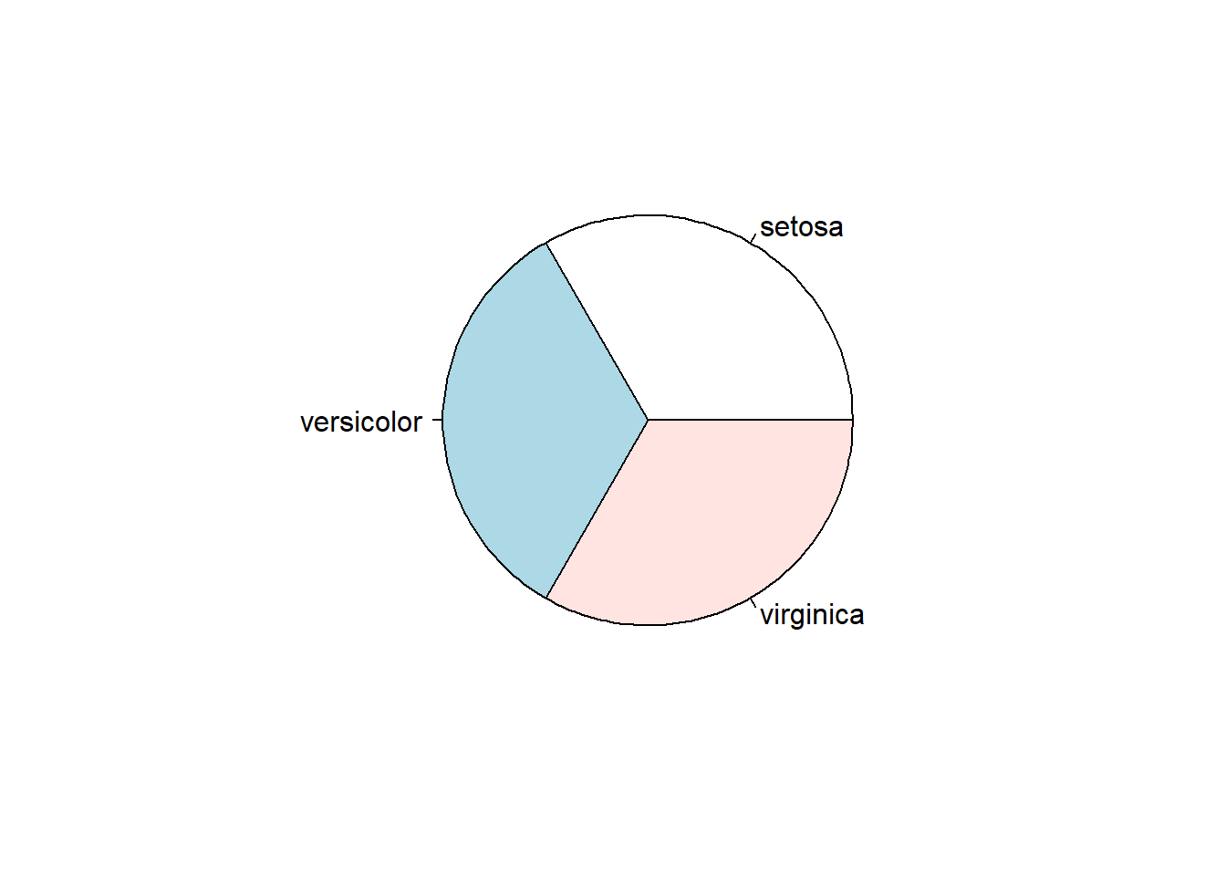
You can view the full list of available parameters for this and other functions through the help tab in the files pane in R Studio.
17.2.4 Bar Plot
Let’s try a bar plot on the same dataset with the “barplot” function.
barplot(table(iris$Species))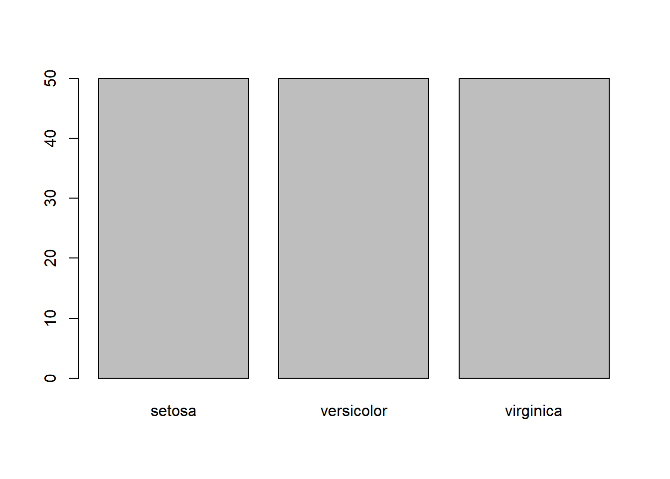
17.2.5 Histogram
You may recall that we also used histigrams in the outliers chapter to try to visually identify extreme values. Here’s a quick recap:
hist(mtcars$mpg)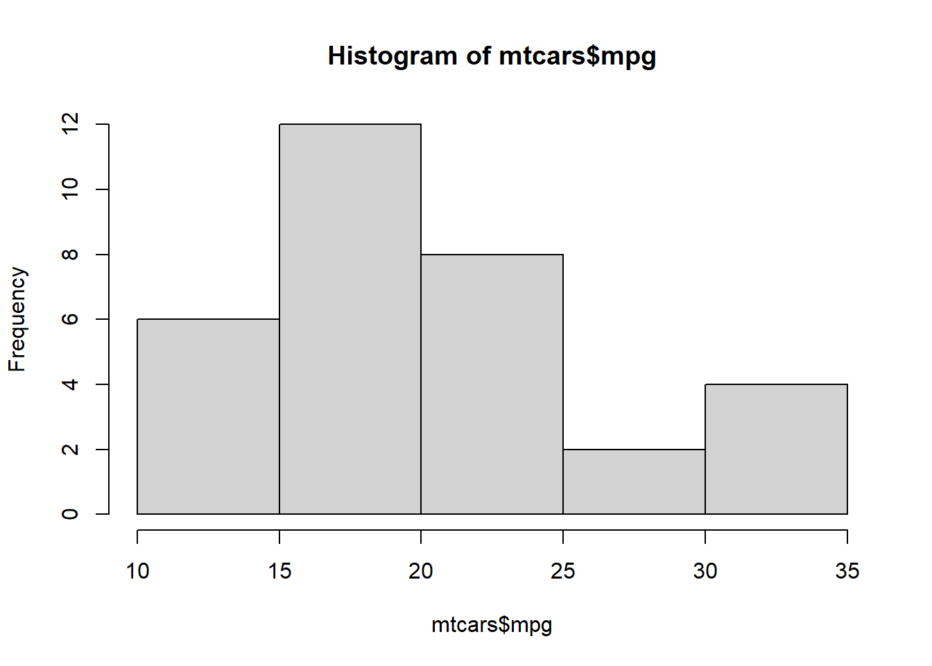
17.2.6 Density Plot
We also used the following example in the outliers chapter to create a density plot:
plot(density(mtcars$mpg))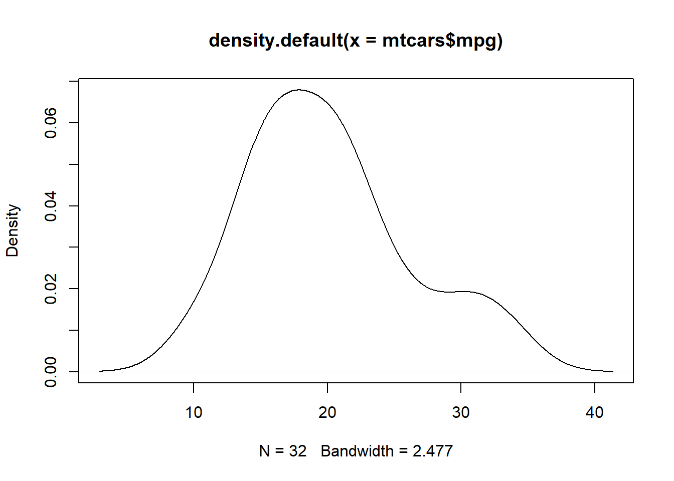
We can take this one step further by adding a title and a shape to the plot.
mpg <- density(mtcars$mpg)
plot(mpg, main="MPG Distribution")
polygon(mpg, col="lightblue", border="black")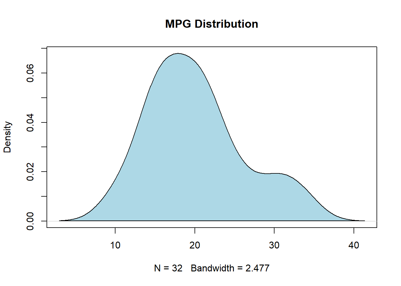
17.2.7 Dot Chart
salesperson <- c("Susan", "Taylor", "Steven"
                    , "Michael", "Reagan", "Michael"
                    , "Alaka", "Trevor", "Isaac"
                    , "Jordan", "Aaron", "Miles")
product <- c("Professional Services", "Professional Services"
                , "Professional Services", "Professional Services"
                , "Software",  "Software",  "Software",  "Software"
                , "Hardware", "Hardware", "Hardware", "Hardware")
sales <- c(10, 7, 13, 18, 12, 19, 14, 16, 21, 9, 17, 19)
df <- data.frame(salesperson = salesperson, product = product, sales = sales)

dotchart(df$sales)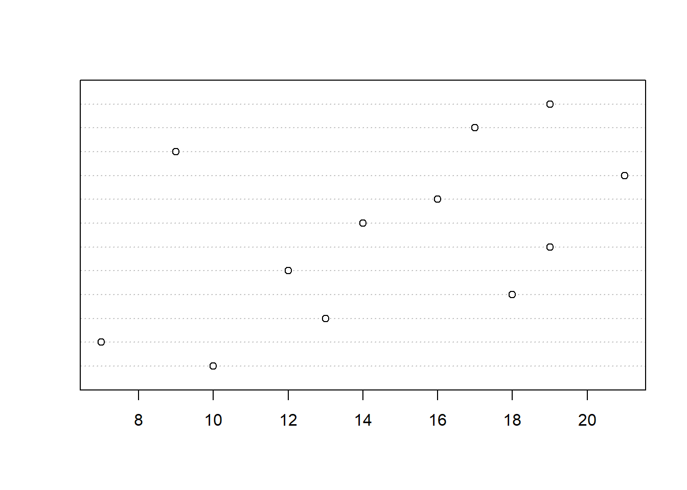
dotchart(df$sales, labels = df$salesperson)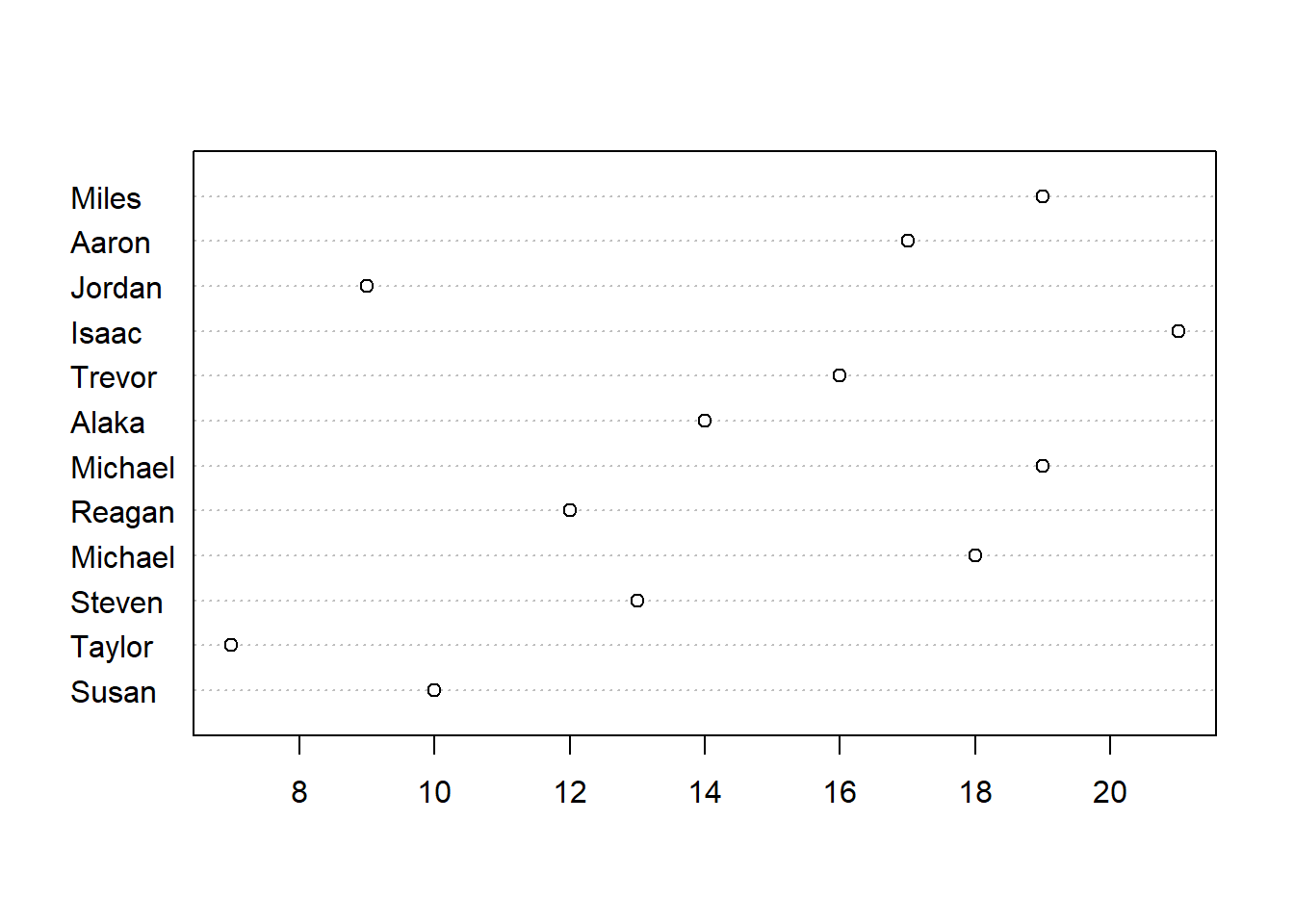
groups <- as.factor(df$product)
dotchart(df$sales, labels = df$salesperson, groups = groups)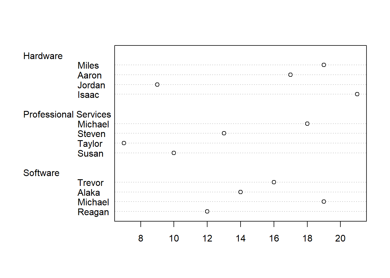
group_colors <-  c("blue", "darkred", "darkgreen")
dotchart(df$sales
            , labels = df$salesperson
            , groups = groups
            , gcolor = group_colors)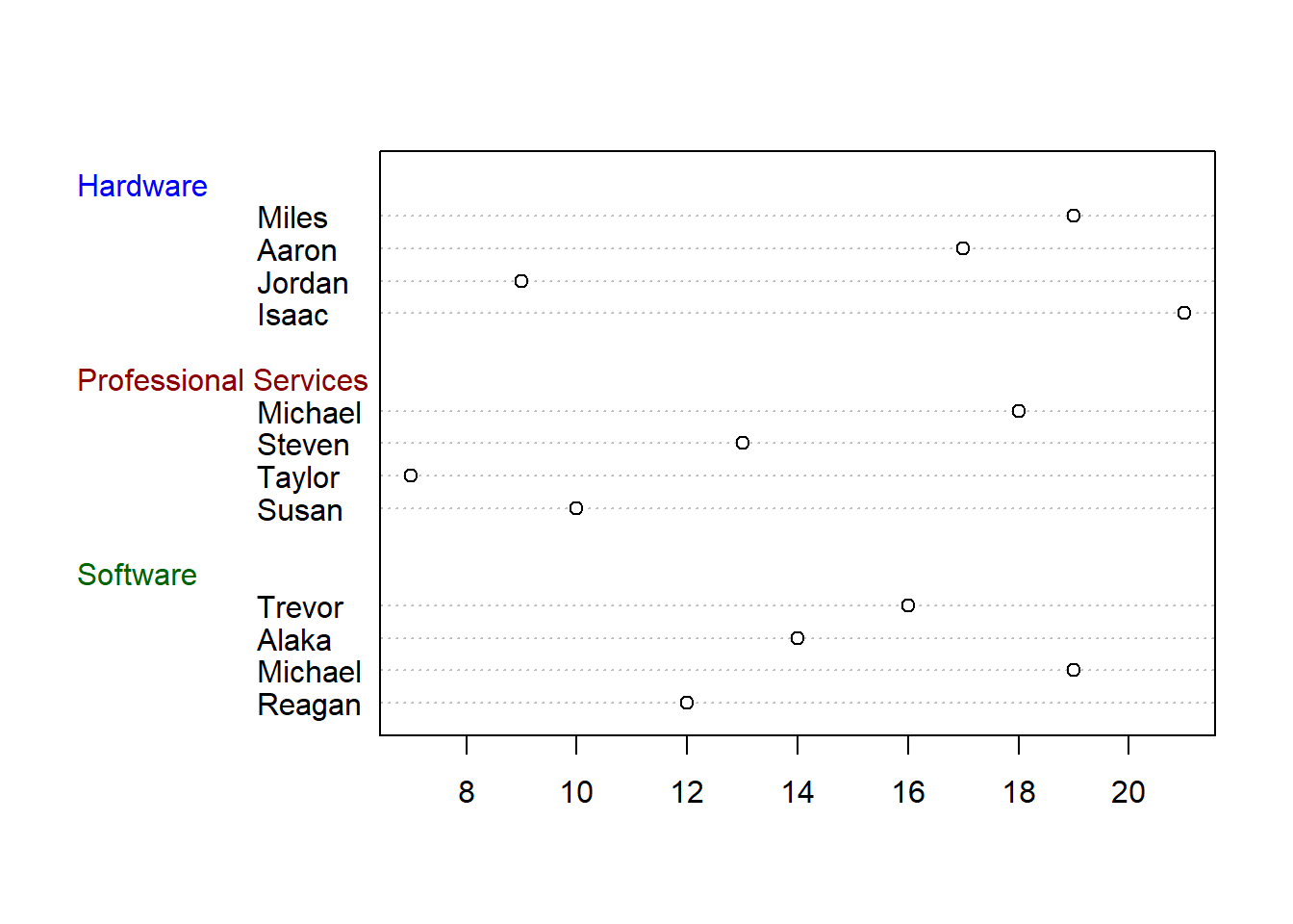
dotchart(df$sales
            , labels = df$salesperson
            , groups = groups
            , gcolor = group_colors
            , color = group_colors[groups]
            , pch = 16)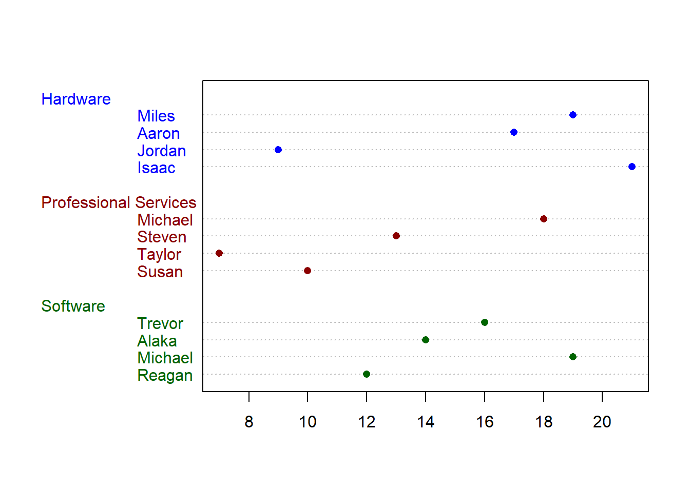
17.3 Resources
- ggplot2 documentation: https://ggplot2.tidyverse.org/
- ggplot2 cheat sheet: https://github.com/rstudio/cheatsheets/blob/main/data-visualization.pdf
- ggplot2 extension gallery: https://exts.ggplot2.tidyverse.org/gallery/
- R colors: http://www.stat.columbia.edu/~tzheng/files/Rcolor.pdf